The Psychology of Colors in Interior Design: How to Choose the Perfect Palette for Your Space
When designing an interior space, colors are more than just a visual choice—they have the power to influence emotions, moods, and even behaviors. The psychology of colors in interior design plays a crucial role in creating spaces that feel comfortable, luxurious, or even energizing. Whether you’re decorating a home, office, or retail space, understanding how colors affect the human mind can help you make the right design choices.
The Impact of Colors on Mood
Different colors evoke different emotions. Here’s how some of the most commonly used colors in interior design affect our psychology:
- Blue – A calming and serene color, blue is perfect for bedrooms and offices as it promotes relaxation and focus.
- Red – This bold color is associated with passion and energy, making it a great choice for dining areas or entertainment spaces where excitement is desired.
- Green – Representing nature and tranquility, green is ideal for living rooms, home offices, or any space where you want a sense of balance and harmony.
- Yellow – A cheerful and uplifting color, yellow works well in kitchens and dining areas, but too much of it can cause anxiety.
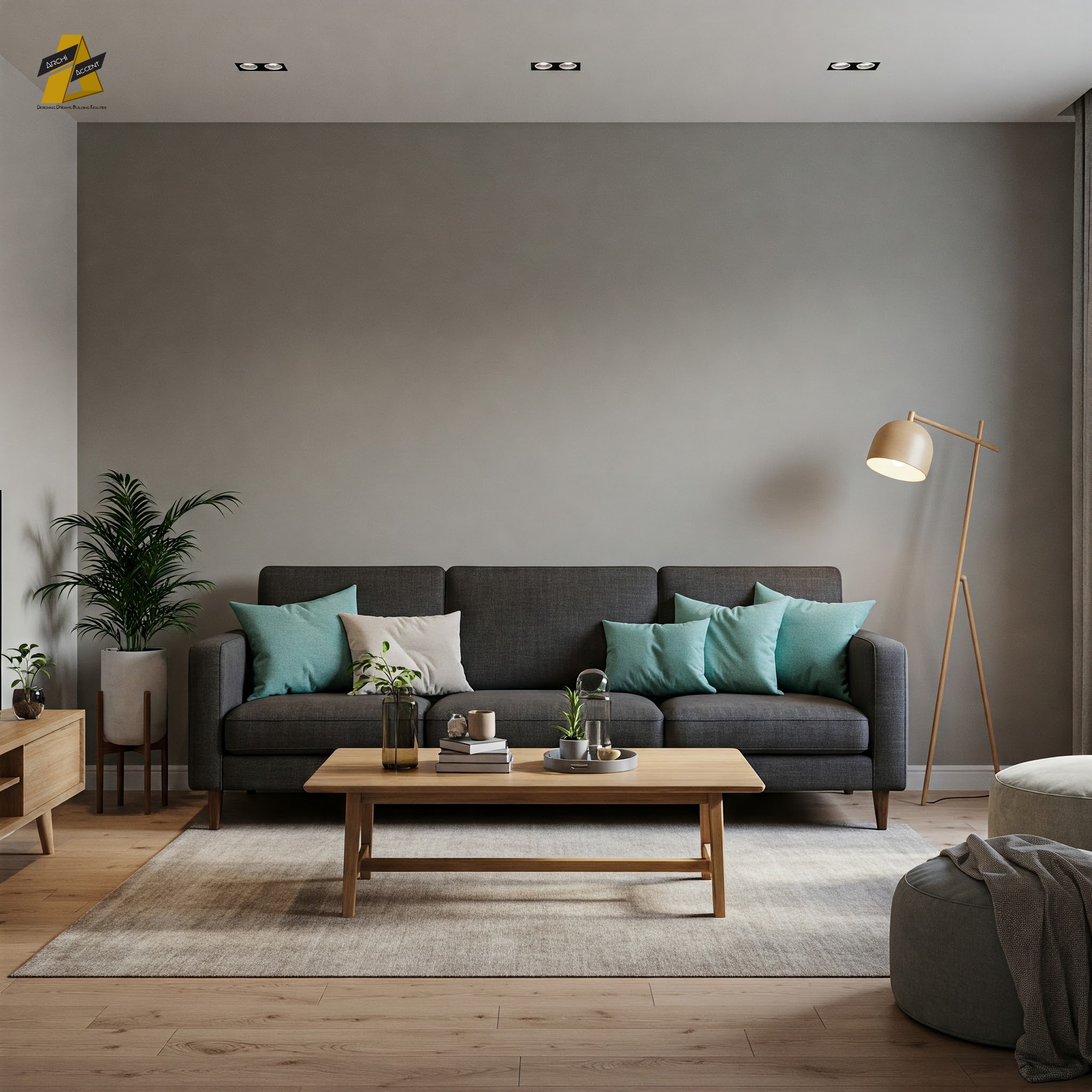
- Gray – A sophisticated and neutral shade, gray is perfect for modern interiors, providing a timeless and elegant appeal.
- Black – The ultimate color for luxury and drama, black should be used strategically in accents or furniture to avoid making a space feel too dark.
- White – Representing cleanliness and simplicity, white is ideal for minimalistic designs and small spaces as it creates an airy, open feel.
Choosing the Right Color Scheme for Your Space
- Consider the Purpose of the Room
- A bedroom should have calming colors like blue or green.
- A workspace benefits from neutral tones like gray or beige to enhance concentration.
- A living room can have warm and inviting shades like earthy tones or soft pastels.
- Use the 60-30-10 Rule
- 60% of the room should be the dominant color (walls and large furniture).
- 30% should be the secondary color (furniture, curtains, etc.).
- 10% should be the accent color (decorative pieces, cushions, artwork).
- Lighting Matters
- Natural light enhances colors, making them appear softer.
- Artificial lighting can alter how colors look—cool white lights enhance blues, while warm yellow lights make reds and oranges more vibrant.
- Test Before Committing
- Always test paint swatches under different lighting conditions before finalizing a color.
- Consider how different materials, like wood and metal, interact with the chosen colors.
The right color scheme can completely transform a space, affecting both its aesthetic appeal and emotional impact. Whether you’re designing a home, office, or retail store, using color psychology can help you create a space that not only looks great but also feels right. So, before you pick up that paintbrush, take a moment to consider how your color choices will shape the atmosphere of your interior design.
Tazkia Tahia
Media Content Executive of Archi Accent


